
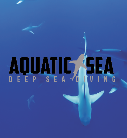
Sharks are one of the biggest fears due to mankind. Majority from thriller horror movies such as Jaws that makes these beasts out to be killers. The goal for Aquatic Sea was to provide a safe, non-hazardous place for people to face fears in the ocean with sharks and get a proper education about the animal and how they are not your average JAWS. Using inviting imagery that portrays the fish to look gentle and more relaxed was the best way to advertise the deep sea diving company. Being someone who fears sharks them self I have always been curious and wanted to make special events that could help rationalize the fear. Come dive in to Aquatic Sea!
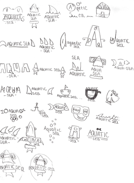
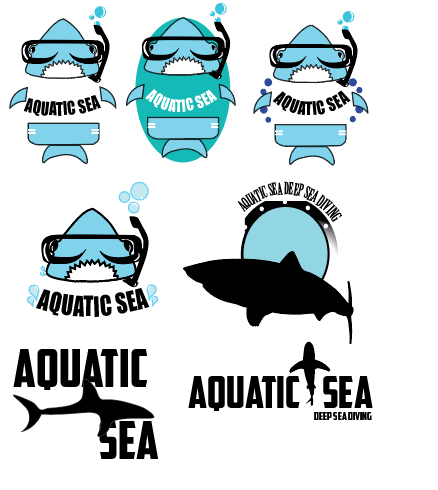
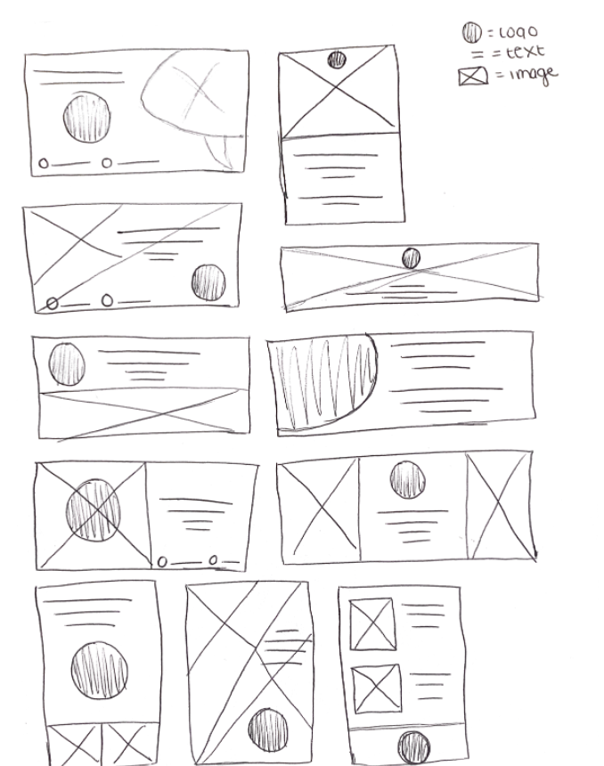
Buckling down to the final sketches, I wanted to keep the logo very professional for adults but also children in welcoming all ages to deep sea dive. I wanted to change the “cute” adorable logo in the original sketch to something that screams “diving” and “sharks”, something more direct and powerful. The logo was meant to be broad and impactful on viewers that witness the logo and campaigns.
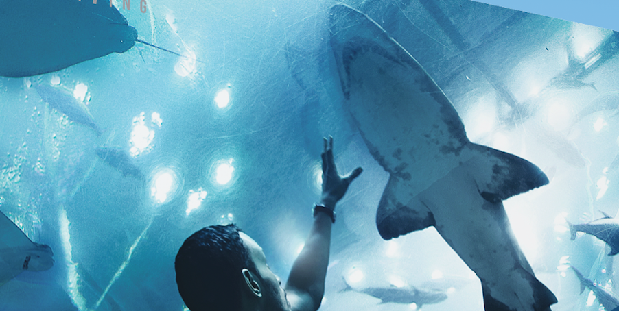
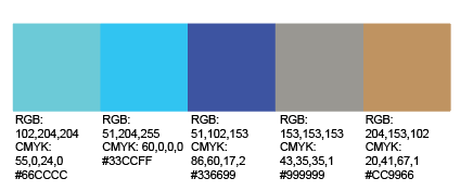
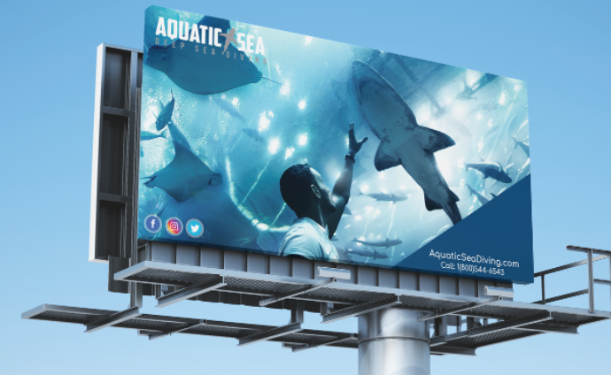
When thinking on colors schemes, layout and imagery. I really wanted to showcase human interaction with the worlds scariest fish, the shark. By showing these gentle giants with no teeth and humans interacting helps motivate audiences to capture and want to know more about the beasts. Through uses of cool blue, white, and black the tone I wanted to give was mellow and comfortable almost as if you could feel the water or maybe even the body of the fish. I made sure to include those elements throughout each design whether it was a road side billboard, or traffic / interstate billboard on the freeway.

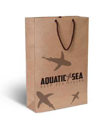
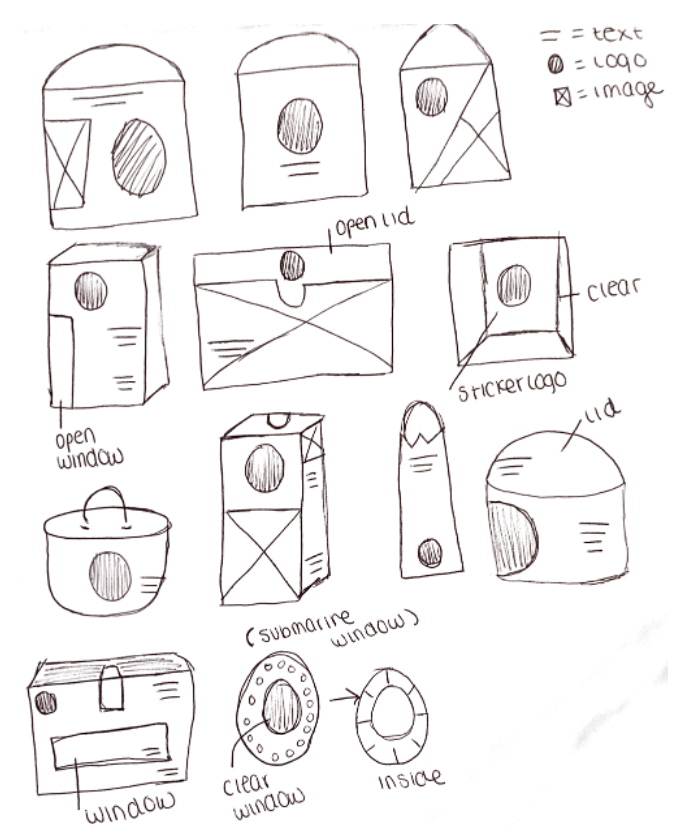
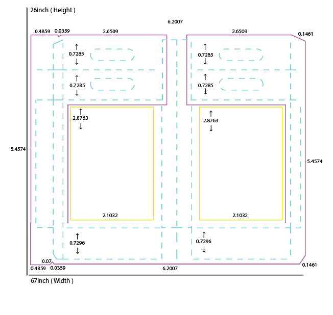
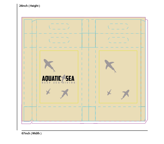
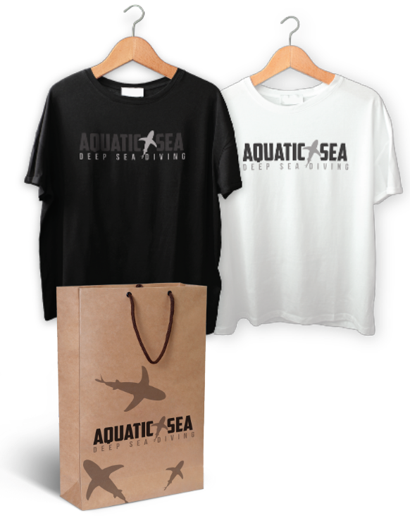
When thinking upon a product for Aquatic Sea, I wanted to make giftbags visitors could bring home from the shop / experiance. These bags would be made of a heavy recycable material allowing visitors to purchase t-shirts, wet-suits or plain souvenirs. The bag would consist of small, medium, and large with the logo primarly in the center for attraction and branding. The shirts were a simplistic feel of a black & white showcasing the logo inverted within both. No color, just simplicity, direct, & unique to match the overall brand.
